Northstar
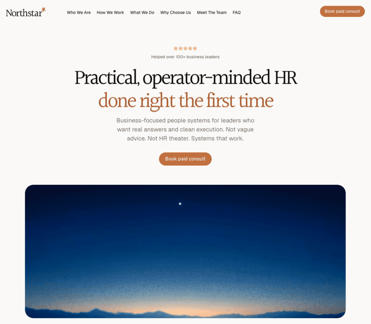
Practical, operator-minded HR done right the first time.
An operator-led HR consultancy from an ex-Head of People at FanDuel going independent. I designed the brand and the website that launched it: identity, voice, and a production site that walks a leader from diagnosis to handoff and resolves to a paid consult.
An agency that guides.
Northstar's founder is an ex-Head of People at FanDuel going independent. The small agency they run is built to put that operator background to work for leaders who have paid for HR consulting before and walked away with a deck and no system.
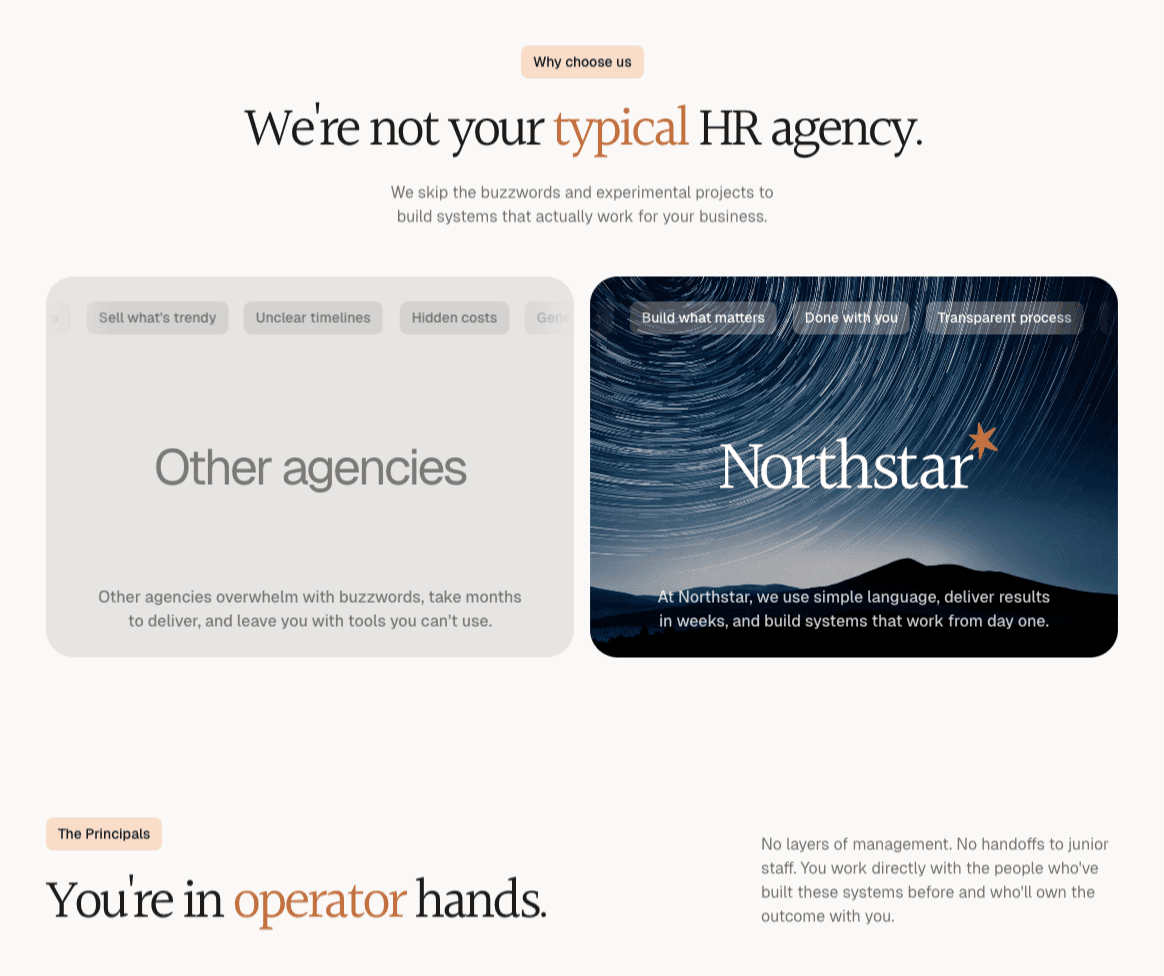
Northstar is a small agency offering a service business, and the brand needed to land that posture from the first impression. There is no direct product competitor in the frame.
I led both workstreams. Brand and web.
A consultancy for leaders who are done with vague advice.
Northstar's audience is the founder, COO, or chief-of-staff at a scaling company who has paid for HR consulting before and walked away with a deck and no system. Sales, growth, and engineering all have execution disciplines those leaders trust; people work usually does not. The brand had to fill that gap on first read.
The identity sits inside that posture. The lighthouse is the central image. It is the active guide that directs the ship toward safety, toward the correct direction, and toward the destination the leadership team is trying to reach. The mark says what the practitioners do. A warm copper accent against deep navy carries gravity. P22 Mackinac sets the headlines with a single italic word of emphasis per line, so the page reads editorial. Geist carries the body and the chrome. The mark itself is a quiet wordmark with a single star, easy to wear at favicon size, on a footer, or across a slide.
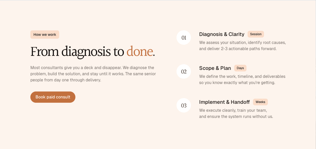
A site built to walk a leader from diagnosis to done.
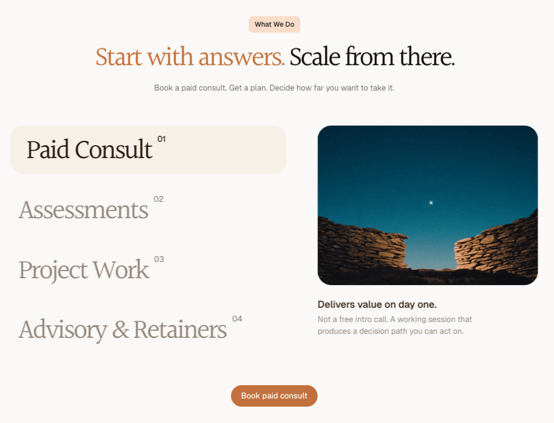
The information architecture follows the engagement itself. A hero that states the promise. A how-we-work section that maps the three steps from diagnosis through scope to implement-and-handoff. A what-we-do section that lays out the four ways to engage: paid consult, assessments, project work, and advisory retainers. Every page resolves to one call to action: book a paid consult.
The design language is restrained on purpose. Tonal cream surfaces, generous whitespace, eyebrow chips above sections, large serif headlines, and a single copper button color so the next action is unambiguous. Photography stays grounded (sky, stone, beacon). The site reads the way the work does: direct, concrete, clean.
What shipped.
Northstar launched at thenorthstar.agency with a brand and site built around the consulting path: diagnose the people problem, scope the work, implement it, then hand it back cleanly. Every page resolves to a paid consult.