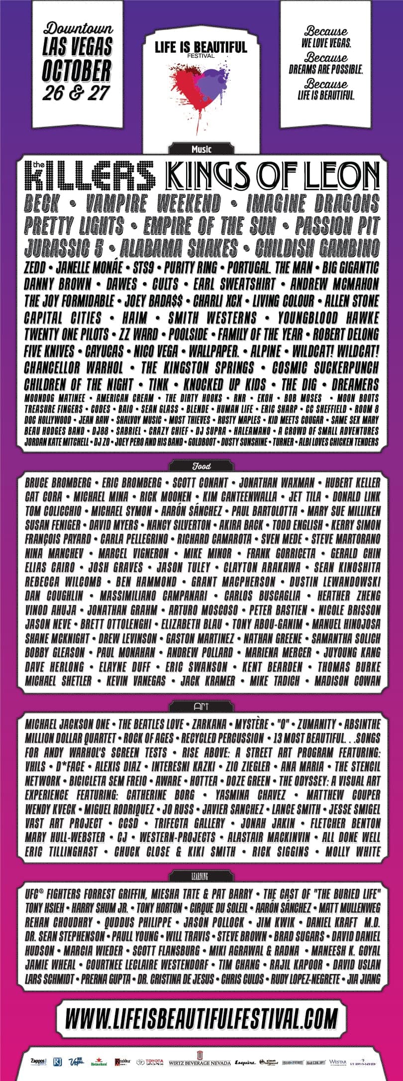
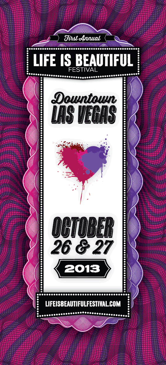
Life is Beautiful Festival
Make a written-off neighborhood feel suddenly possible.
A year-one festival across 18 blocks of downtown Las Vegas, built as the cultural anchor for Tony Hsieh's Downtown Project. My three-person studio won a five-agency pitch, and I led the visual system across the logo mark, 10,000+ pieces of signage, the merchandise line, and the custom CMS feeding the website and the native mobile app.
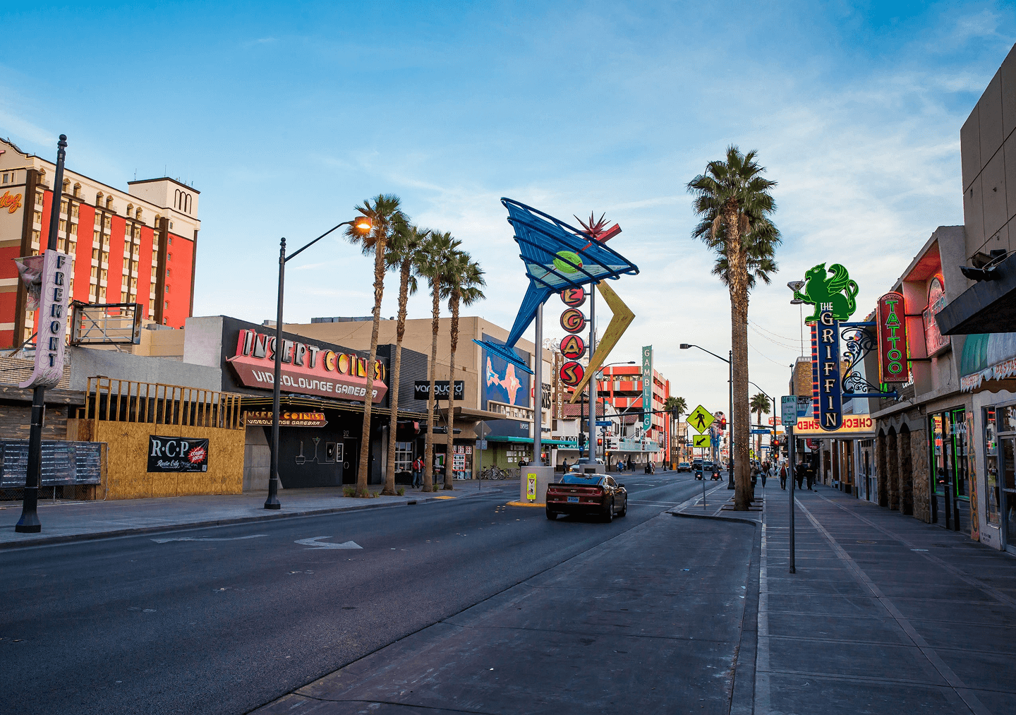
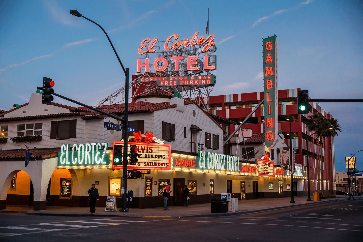
Downtown Vegas, before anyone was paying attention.
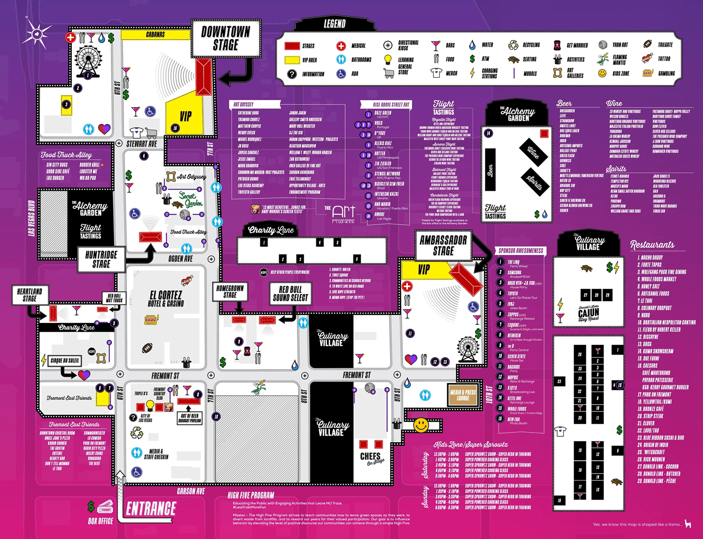
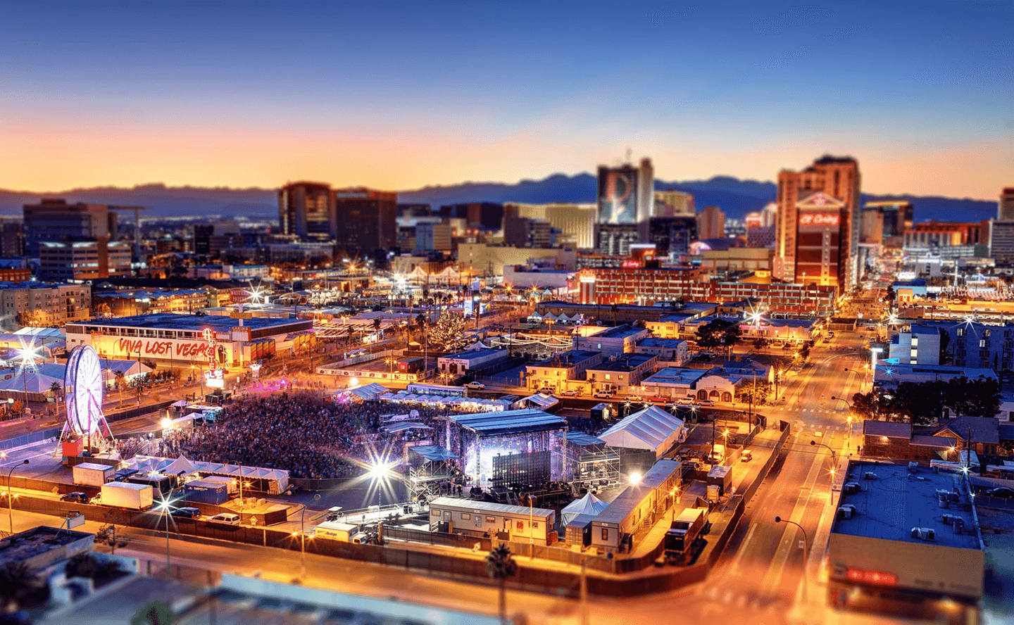
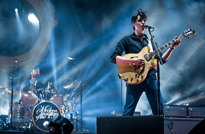
In 2012, Downtown Project was investing $350 million into the neighborhood around Fremont Street, but the area still needed a cultural anchor. The festival brief was three days of music, art, food, and fearless imagination across 18 blocks, before there was a team, a brand, or an operating plan.
Five agencies pitched. My three-person studio won with a brand direction built from the neighborhood itself: graffiti, vintage signage, rooflines, and the visual noise of downtown Las Vegas. I was 24, and I led the visual system for a festival that hadn't been built yet.
The Heart
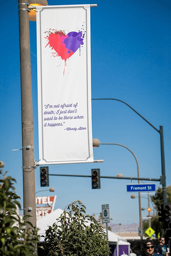
The pitch concept was a raw, paint-splattered heart. Something hand-built and urgent.
The founder had a heart attack in his twenties. The experience reshaped how he saw his life and what he wanted to put into the world. Life is Beautiful was the result, planted in a neighborhood the city had written off. The mark had to carry both: a personal turning point and a cultural renewal.
The creative relationship was direct: me and the founder, no committee, no rounds of options. That directness let the identity move straight from concept into production. The logo became iconic enough that the festival gave out free tattoos of it on opening day, and people lined up.
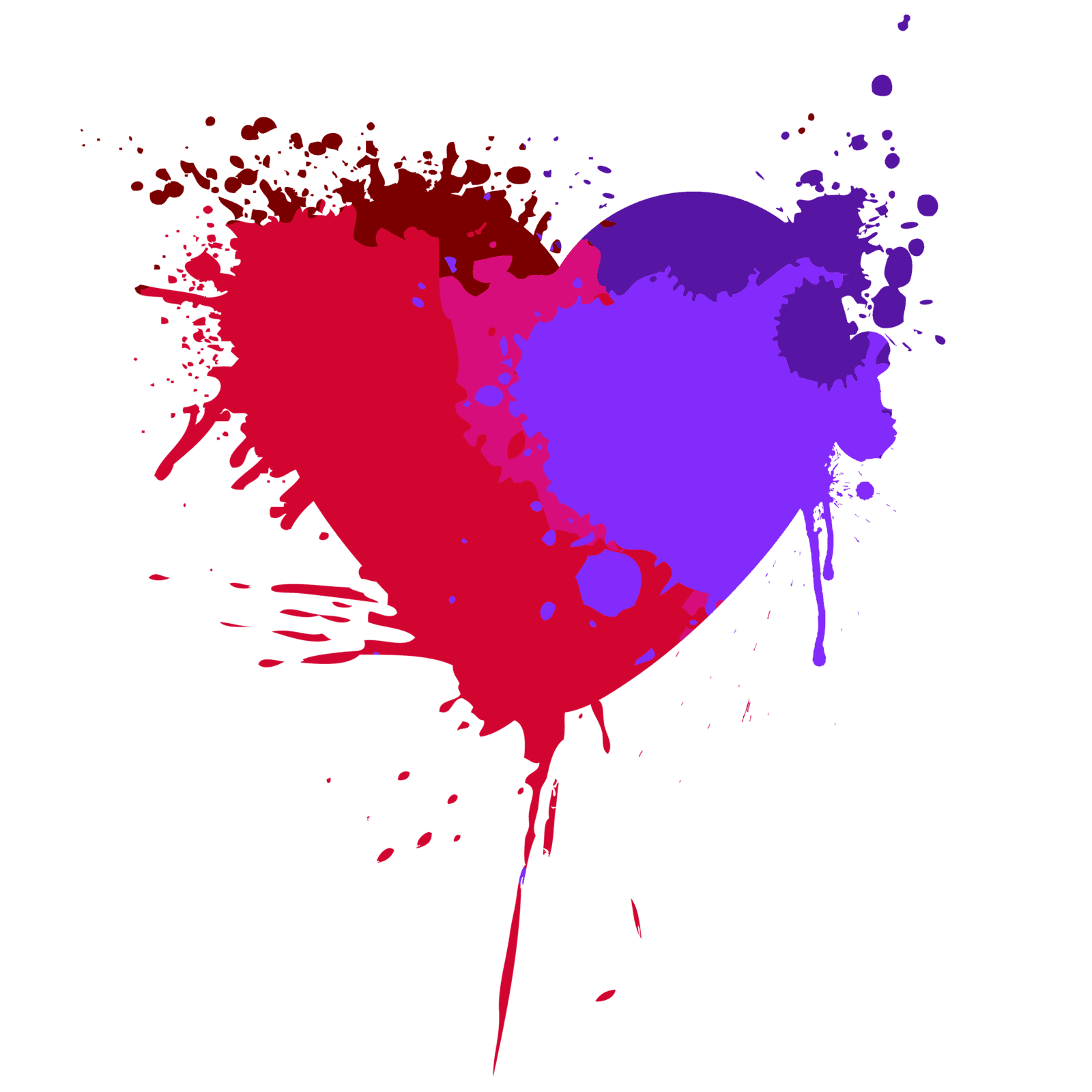
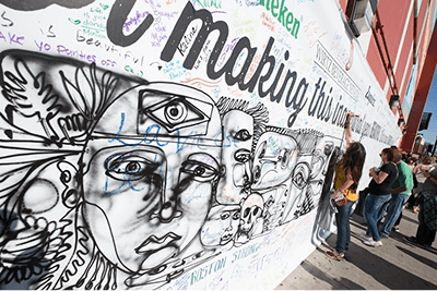
Downtown's graffiti was the visual vocabulary. Raw, layered, defaced, repainted, alive. I drew the heart in that language: paint thrown by hand, edges left rough, a mark that looked older than the festival itself. One symbol holding multiple layers of meaning.
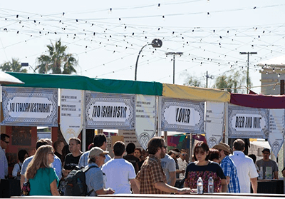
A city wearing one brand for three days.
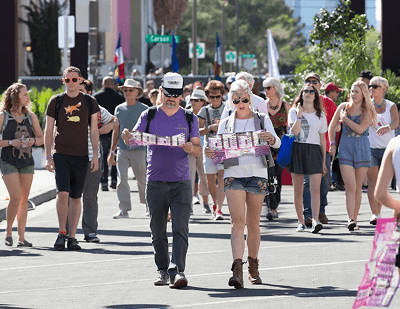
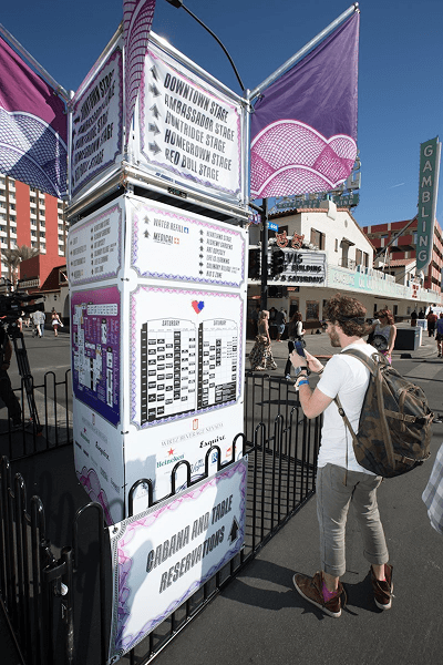
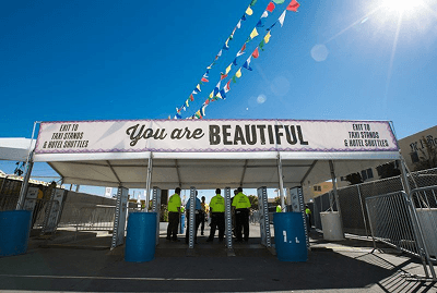
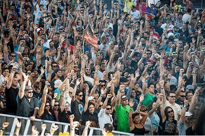
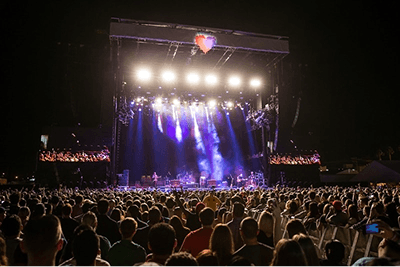
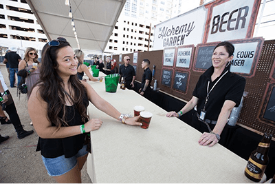
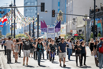
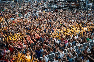
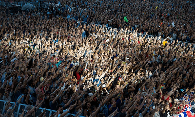
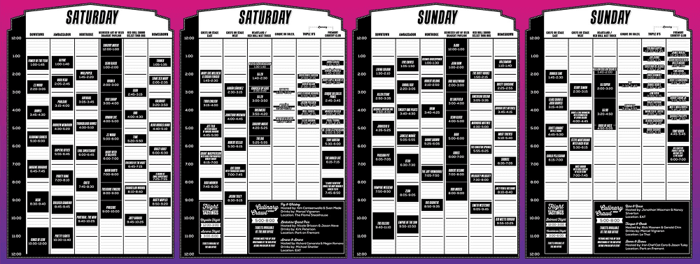
It was 18 blocks of a real city. Streets, buildings you could enter, buildings you couldn't, indoor venues and outdoor stages. The scope was enormous. Over 10,000 pieces of signage including directional wayfinding, informational displays, stage graphics for every performance venue, maps, environmental installations, wristbands for 70,000 attendees, and a full merchandise line of hats, shirts, and posters.
The timeline didn't allow for the typical brand rollout process. There was no opportunity to spend weeks building a 40-page brand guidelines document and then hand it to a production team to execute. The design system, the rules governing how thousands of visual pieces held together across a sprawling physical environment, had to be developed and applied simultaneously.
Every decision about typeface hierarchies, color usage across indoor and outdoor contexts, template structures for rapid production, and stage-specific treatments had to be made in real time and at speed.
I owned the identity and the production rules, and our studio made the system real alongside the print and installation crews. The decisions that would normally live in a style guide were all there: the typeface hierarchies, the color system, the spatial rules, the voice. They just had to be executed under a timeline that compressed months of brand development into weeks.
I was on the ground with the crews right up until the gates opened. We were still placing signs when the first attendees arrived. I jumped on a golf cart and drove out of the path of 70,000 people flooding in.
A CMS built for festival chaos.
Festival booking is chaos. Agents, managers, constantly shifting assets, dozens of artists with changing schedules and imagery. The content had to update daily as the lineup evolved, and it needed to stay in sync across the website, the CMS, and the native mobile app being built by a separate team.
I built the CMS on .NET using our agency's existing application framework. It handled artist profiles, schedule management, and image templates designed for rapid asset swaps as the lineup changed. The public-facing website ran on a custom frontend framework (this was the pre-React, pre-Ember era), and a REST API layer kept the website, CMS, and mobile app pulling from a single data source. The separate team building the native app consumed the data layer I designed.
We built the CMS custom because festival content changes daily, sometimes hourly, and the tools available at the time didn't fit the actual workflow of how festival operations function.
Everything 70,000 people saw or touched.
All of it came from our team: the brand identity, the visual vocabulary, the color system and typography, 10,000+ signs across 18 city blocks, stage graphics for every performance venue, all merchandise, and all printed collateral for 70,000 attendees. Three people made all of it. Plus the website, the CMS, the API layer feeding the mobile app, and the graphic assets the mobile team consumed.